Mega Man 8-Bit Deathmatch Forum
Mega Man 8-Bit Deathmatch V6C FEEDBACK WANTED
Freems • November. 6, 2025, 11:41 PM


November. 6, 2025, 11:41 PM
Copy Link
Hey all you Mega Fans! We're here at a very different time for a very different kind of MM8BDM V6C update.
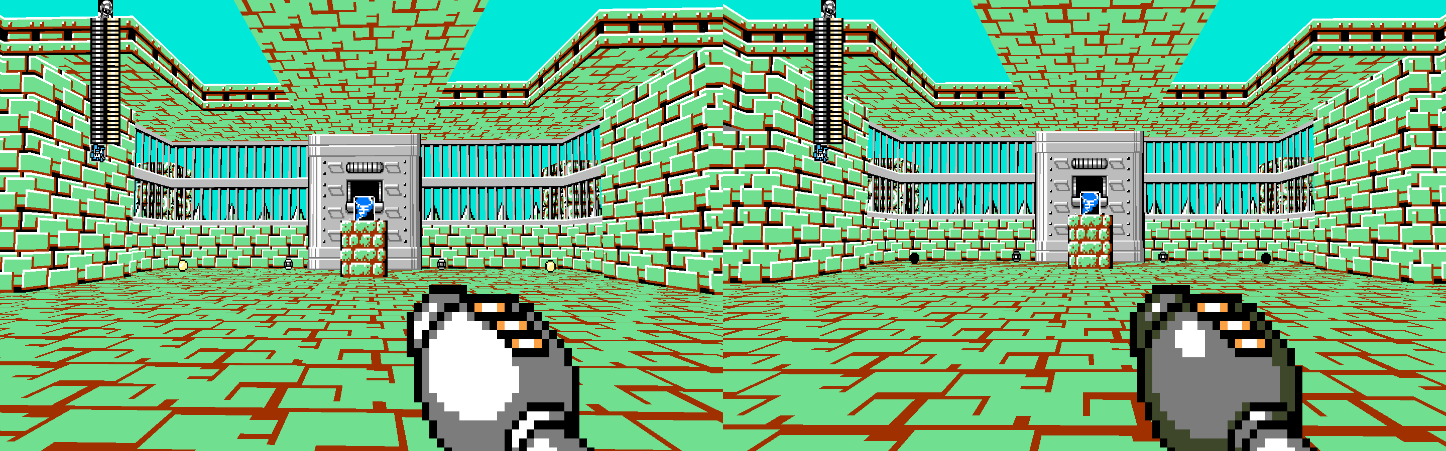
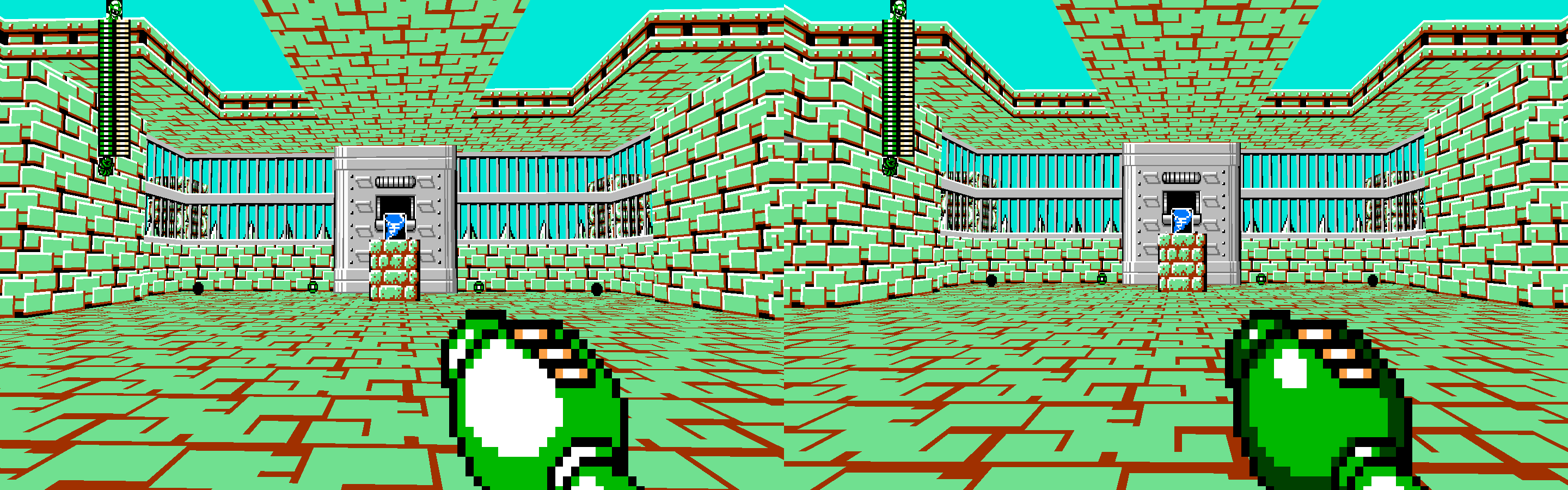
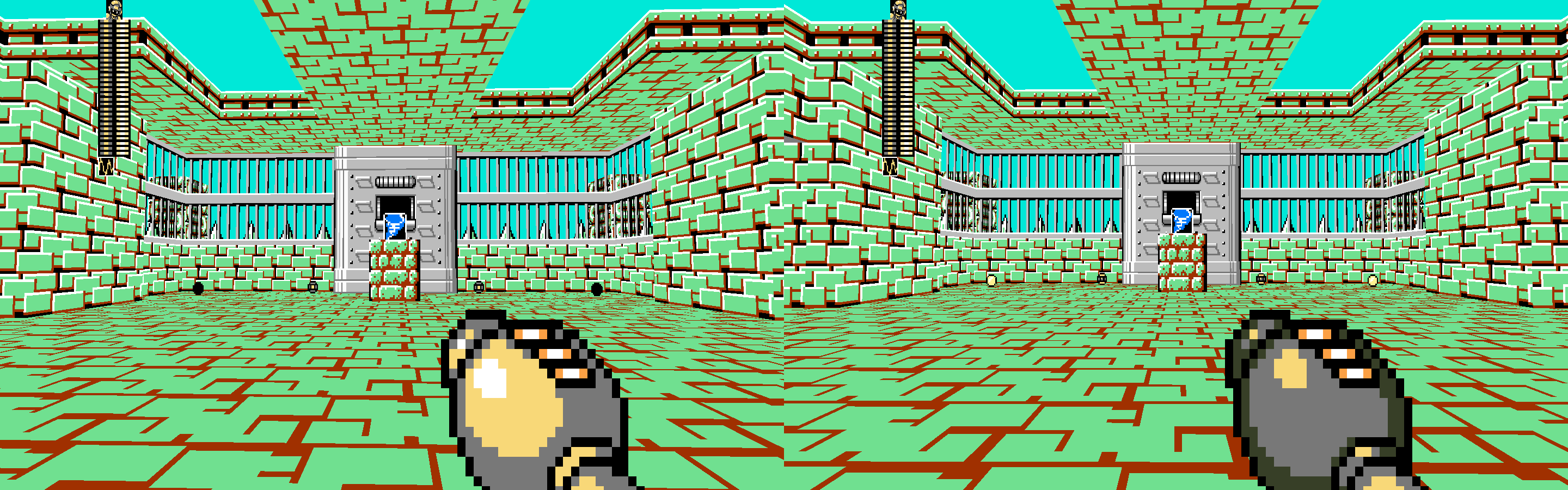
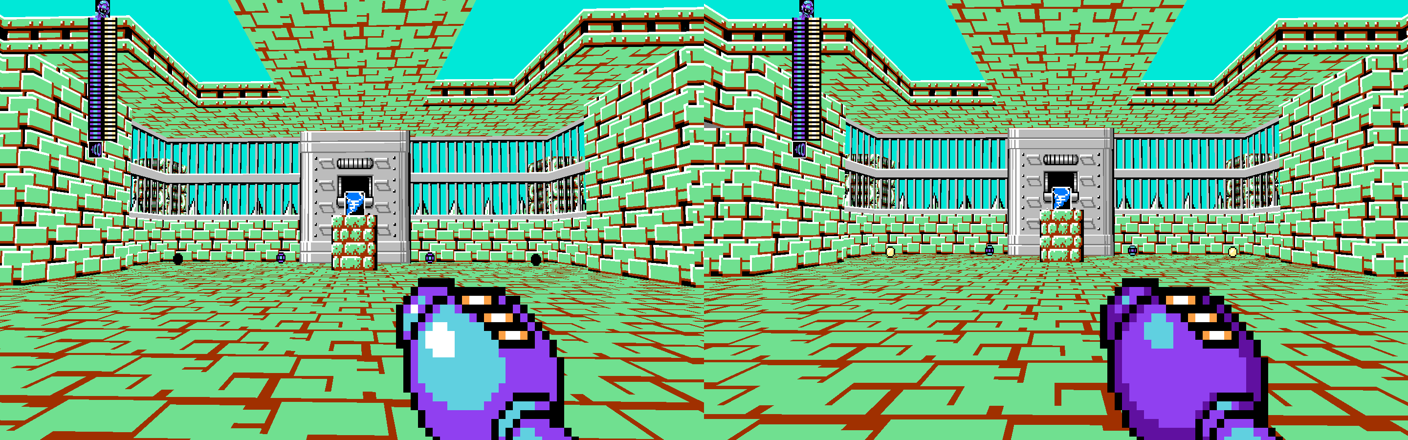
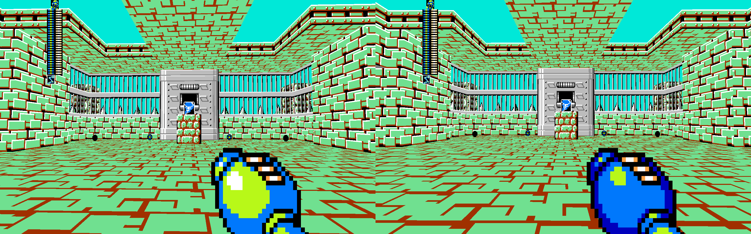
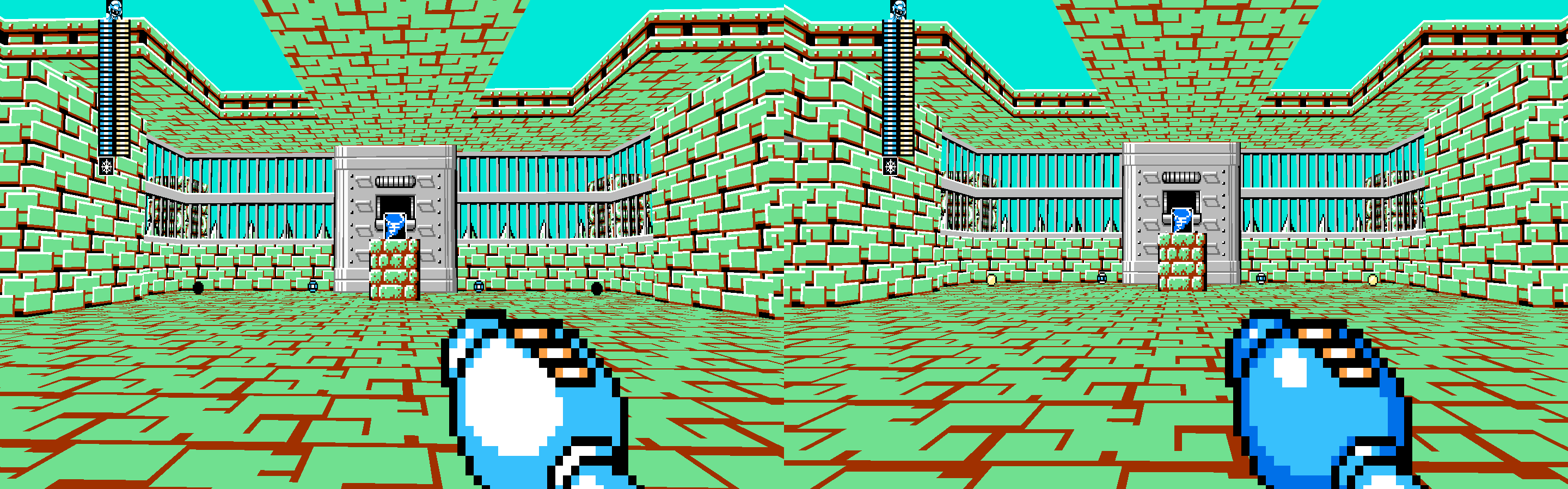
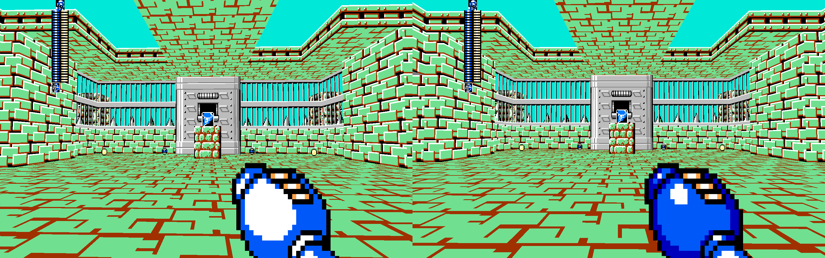
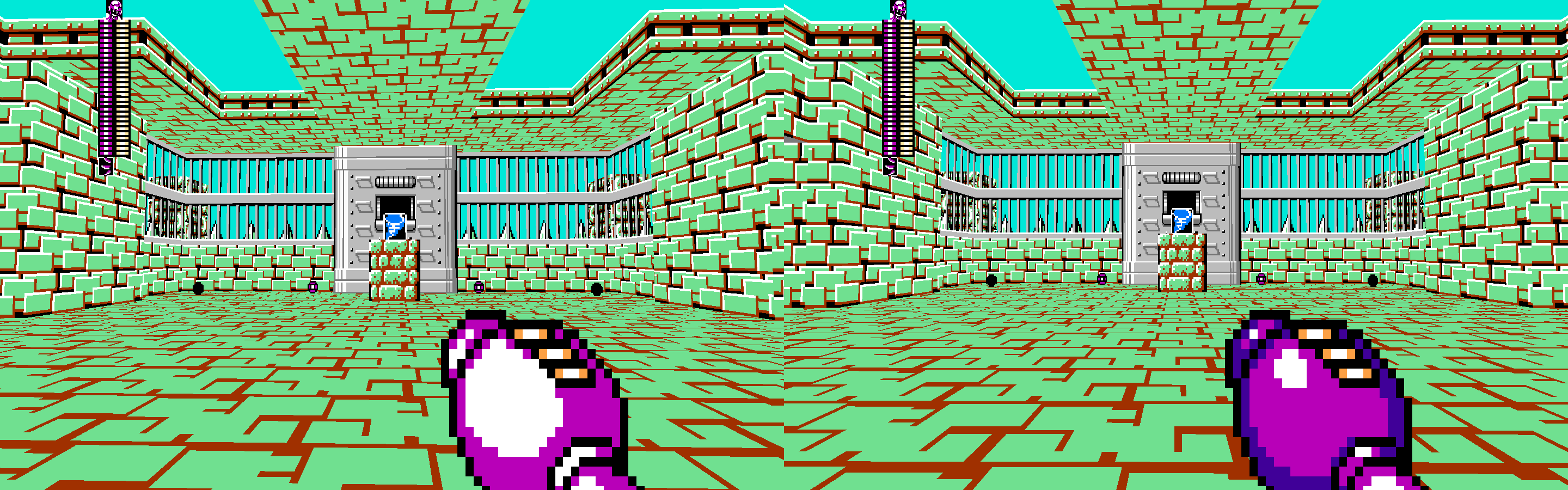
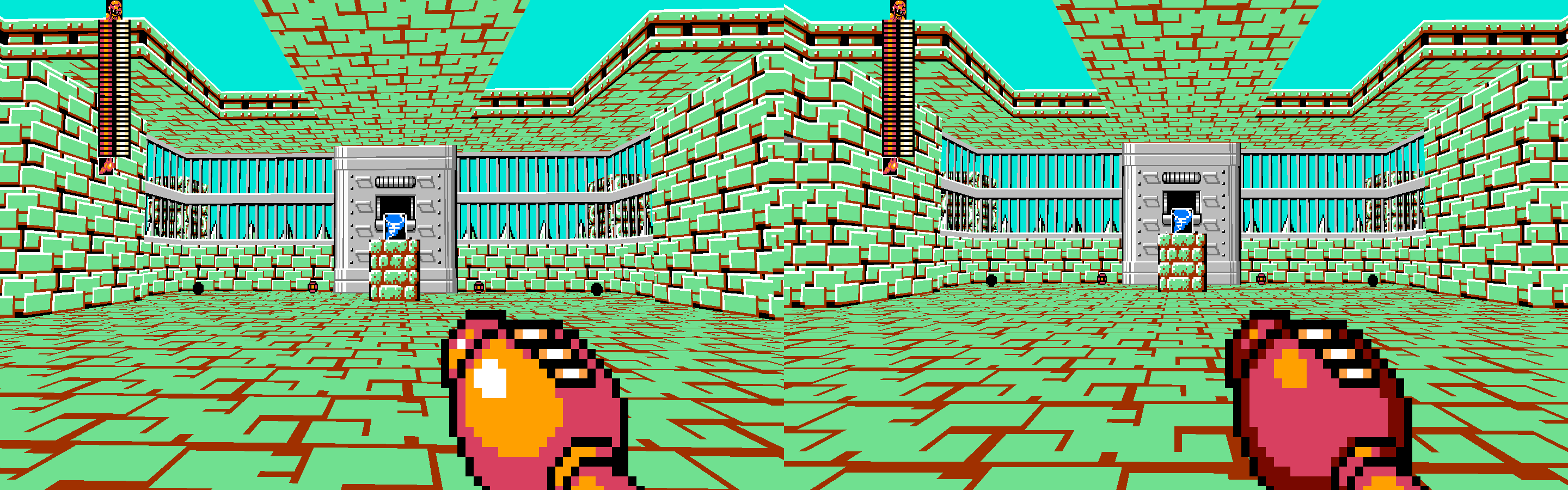
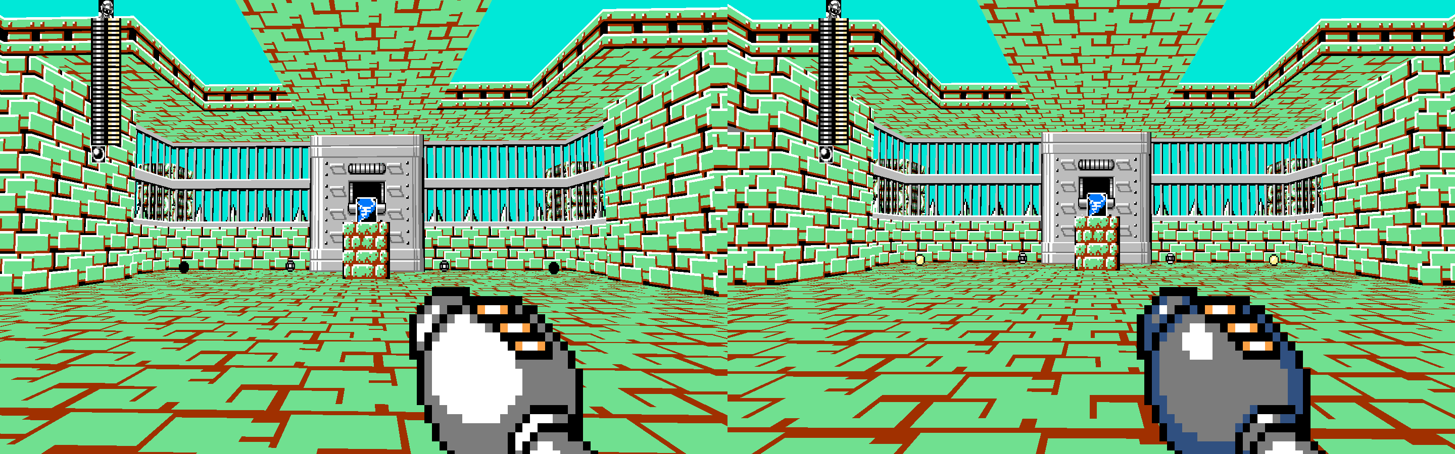
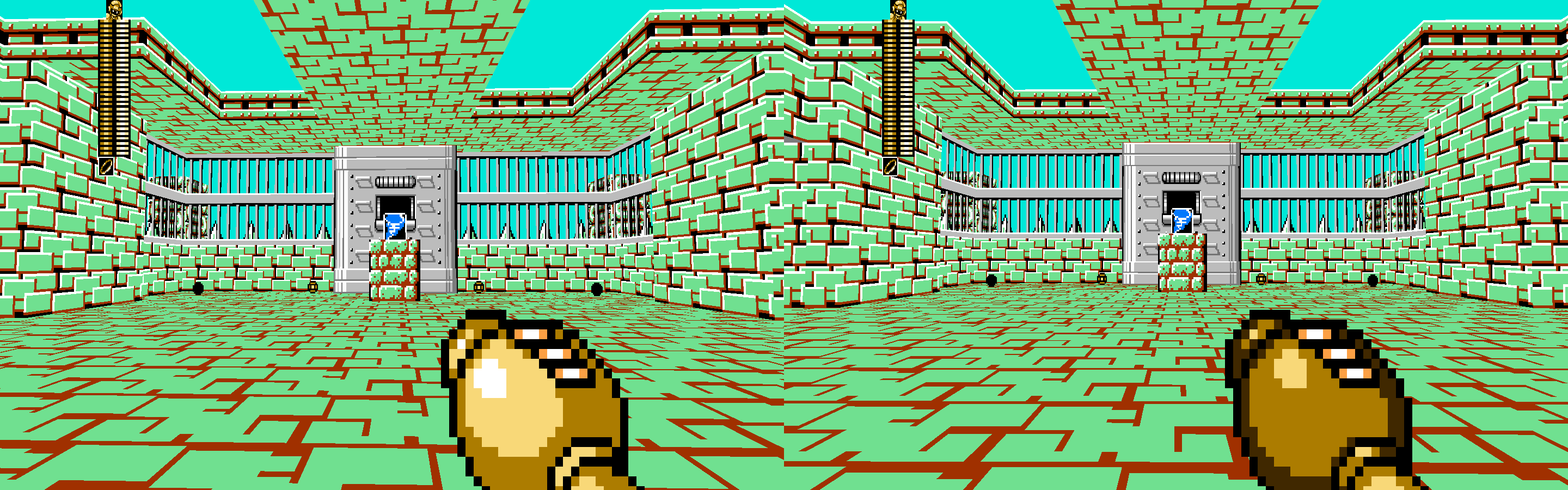
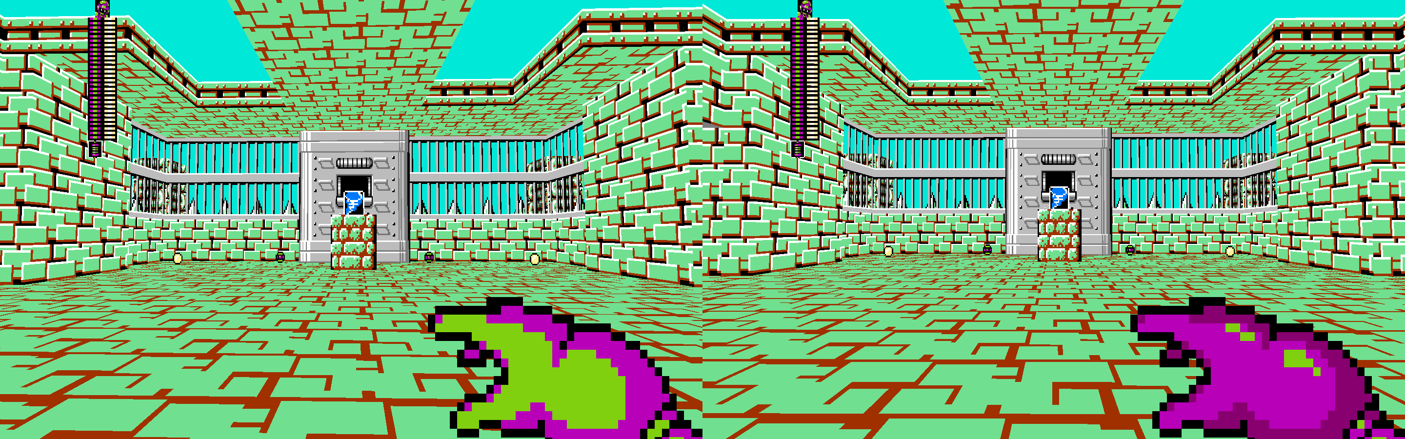
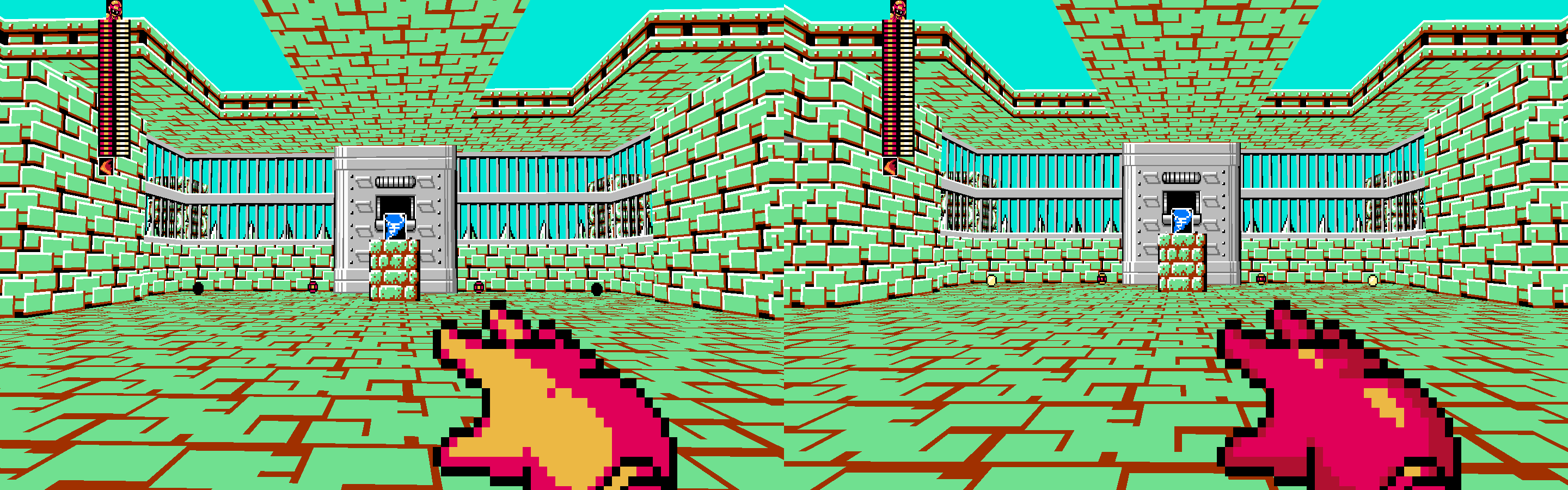
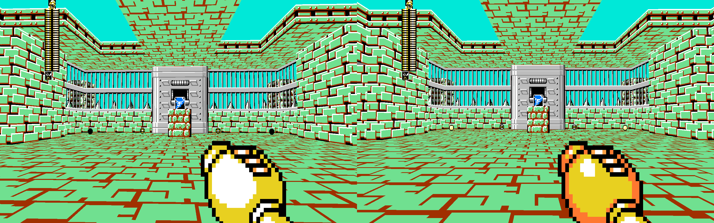
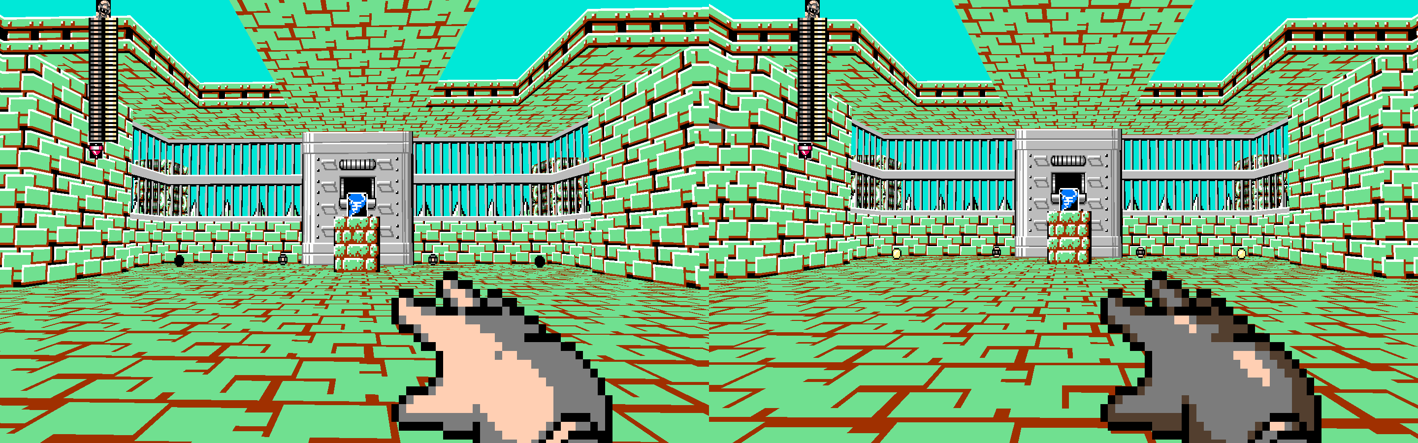
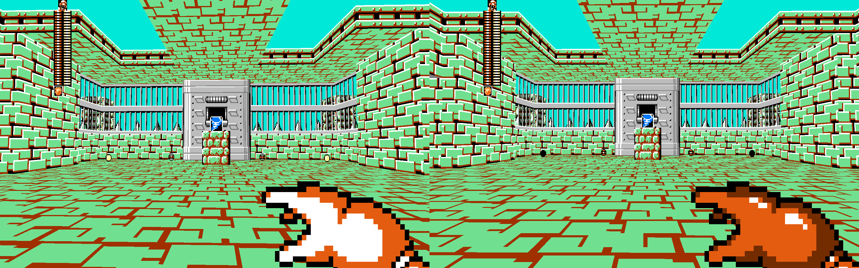
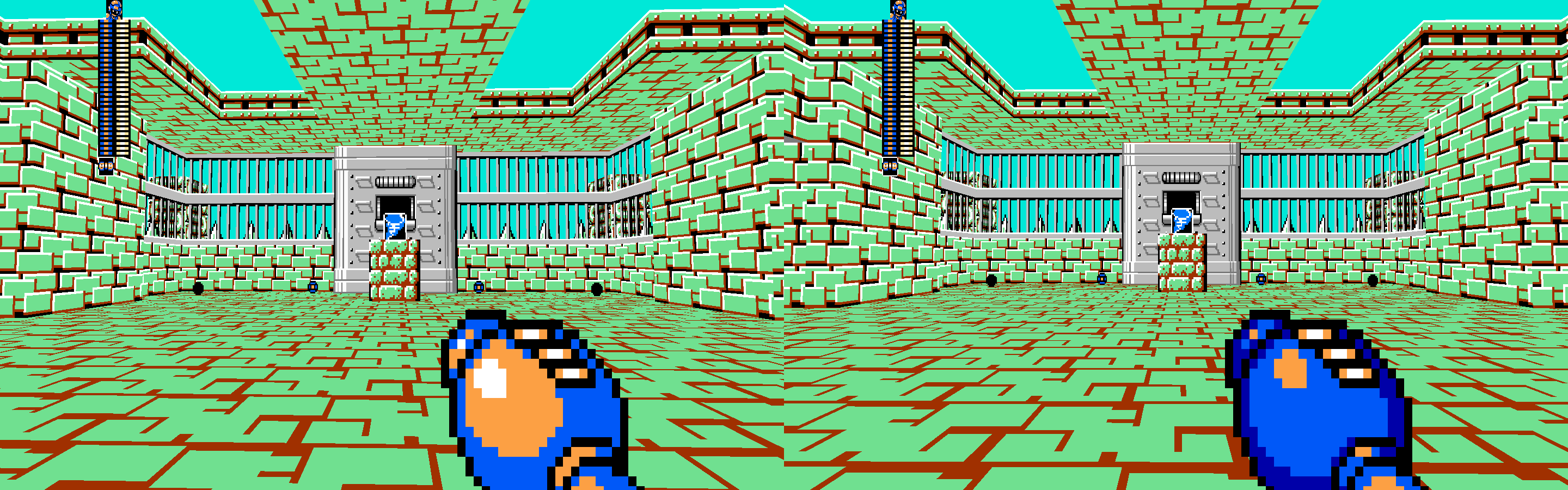
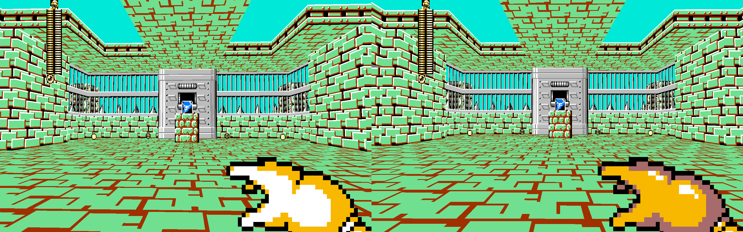
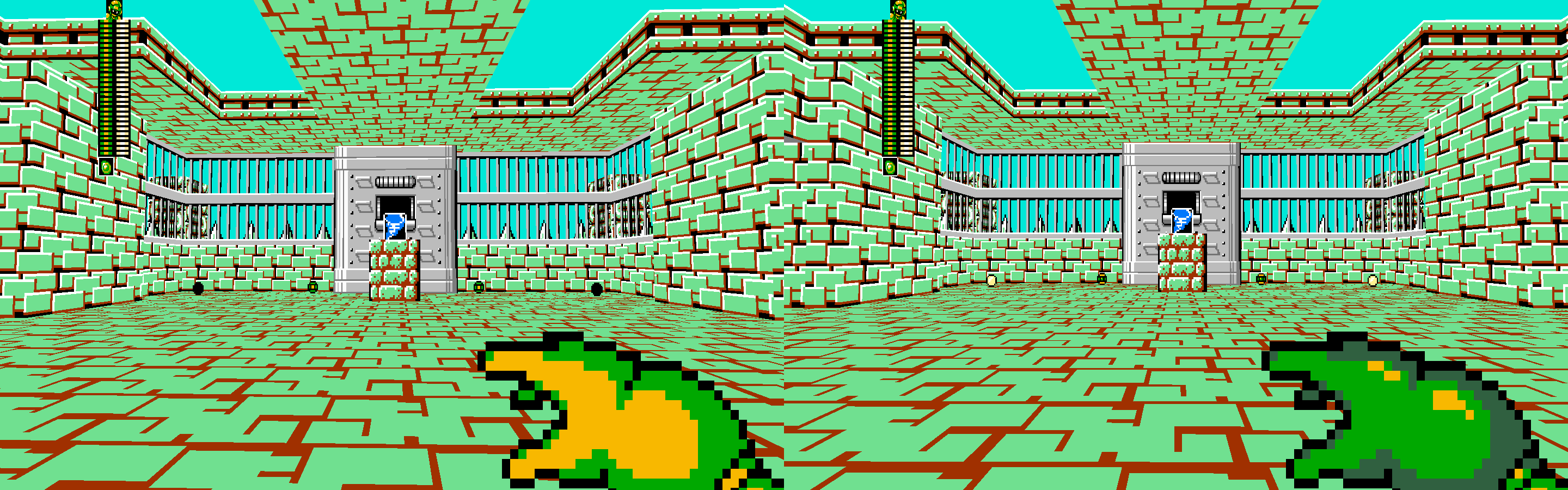
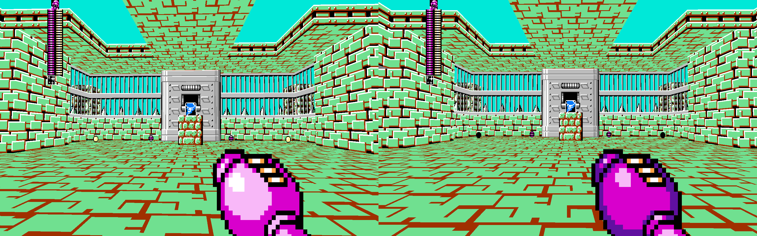
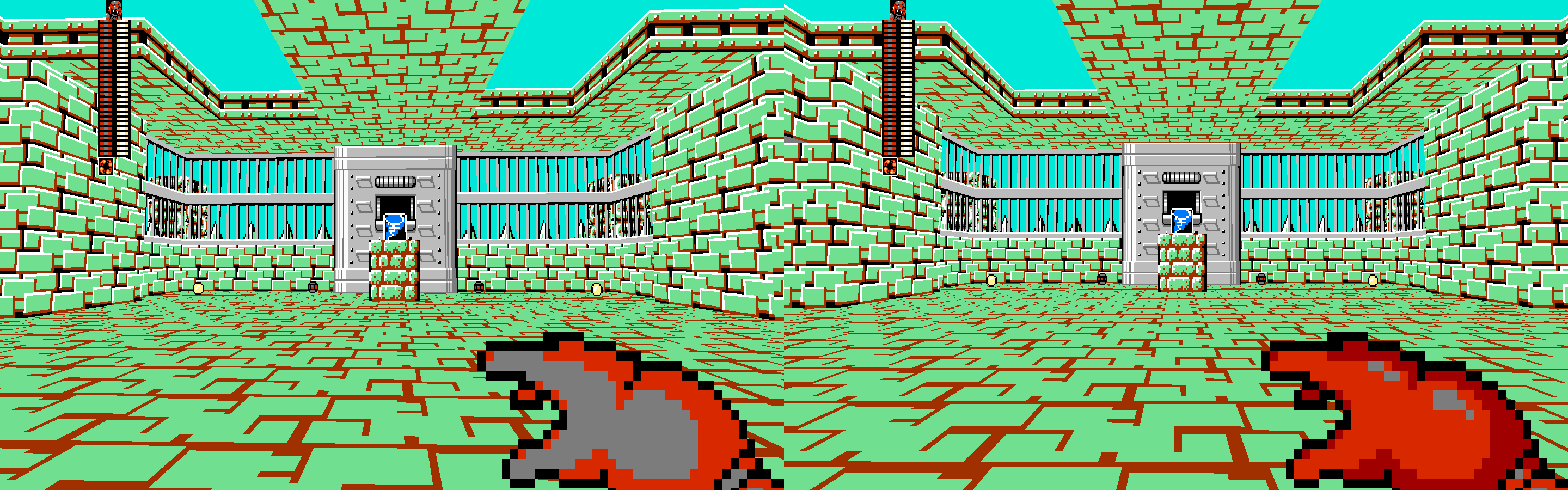
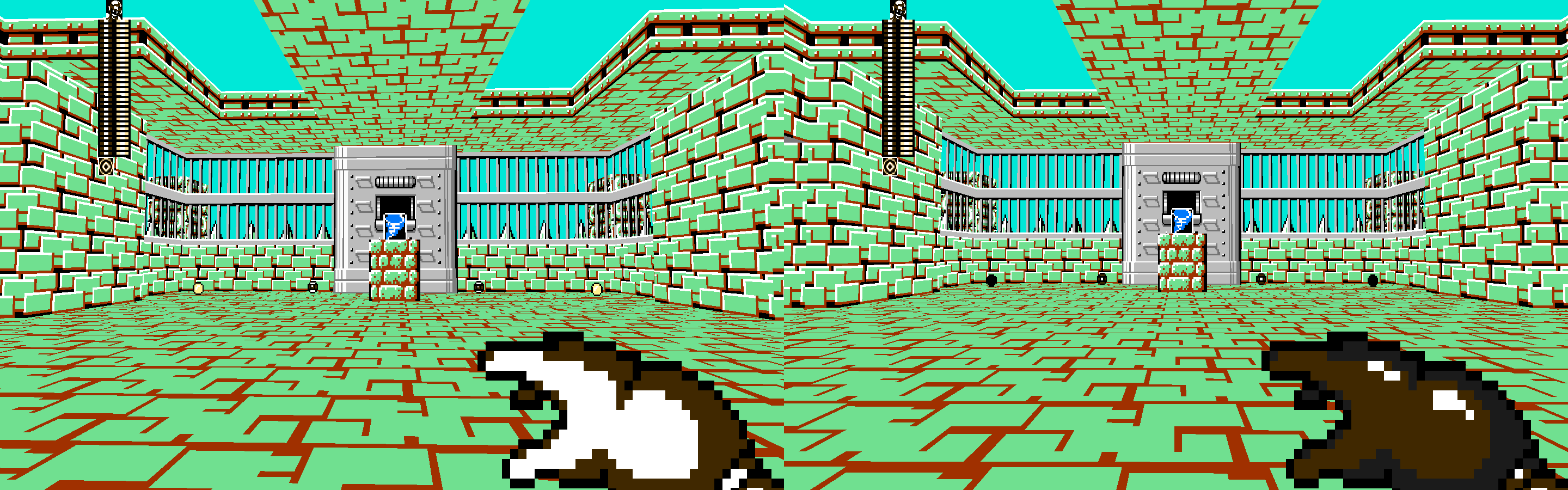
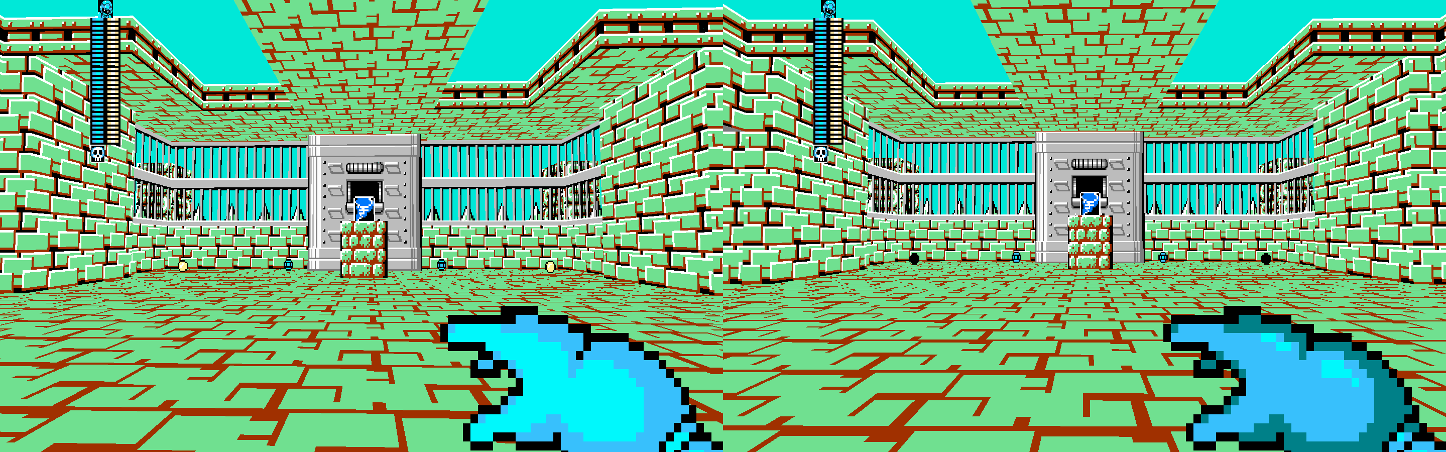
One of our (many, many) goals with V6C has been to update and refine our weapon view sprites all across the board. V6A updated the buster sprites, but we wanted to go back and edit all the other sprites to be up to the same modern standard, as much work as that is. This update is happening in V6C no matter what, so buckle up and get ready for it.
However, we on the development team have reached a little bit of a dilemma. While we were working on these updates, we ended up reaching a very real talking point regarding the amount of details these weapon view sprites should have, namely in terms of the coloring, and how detailed we want them to be. We have the very real opportunity to add what is essentially a 3rd color to our sprites. Instead of just having the view sprites be blue and cyan, it would be blue, cyan, and another darker blue, allowing for more detail, and making the style match both official artwork for the Mega Man series, but also the more detailed weapon get screens from the games.
Before I continue, let me show you all a preview of 25 weapons that use the new sprites, both in the current two color style, and a new three color style. Please note that none of the sprites or colors that you will see below are finalized and they are still subject to change. We normally would prefer to have everything finalized before showing them off, but I believe the community's input here is important enough that I want to post these early. Just remember they are subject to change.
As you can see, even with the updated sprites, the decision to stick with two colors VS three colors is a very large one, and it's one the development team wishes to poll the community at a large about. We're not fully sure as a whole which path to take going forward, as there are a number of pros and cons that I would like to list out.
Pros of Three Colors:
- Matching the style of the official artwork and Weapon Get screens can be considered to be overall prettier to look at and more visually appealing.
- This gives us a unique opportunity to better differentiate weapons that would otherwise share the same colors between them (such as Dust Crusher and Bubble Lead as seen in the above images.)
- With more detailed artwork and sprites being found in many of the game's mods found in the community, this brings the fidelity of the base game up to the same level.
Cons of Three Colors:
- While some might find three colors to be a prettier style to look at, others might find it more out of style.
- There's something of a learning curve with a change like that, and there's a whole lot of muscle memory associated with the current weapon colors, both in terms of those who have played MM8BDM for years, and for those very familiar with the weapon colors in the main Mega Man games.
- Mod creators of weapon packs will have a good deal of extra work on their hand having to update all of their weapons to account for the extra darker color in the sprites.
It is worth noting that modders will have some work required with this update regardless of decision made with the colors, namely with the sprite offsets being changed to account for the new sprites. That said, we will have a fallback in play so you will not be forced to immediately update your custom weapons.
For the reasons listed above, we want to extend this decision with the colors to the community as a whole. Below is a simple poll to vote on which color option you would prefer, and an optional space to write your reasoning if you choose to. It is worth noting that this decision is most likely not one we will come back to later. If we decide on sticking with two colors here, I imagine we will not change our line and change it again in a later version.
Vote for the poll HERE
The poll will stay open until the date of the next V6C Newsletter: Monday, November 24th. The results will probably not actually be released on that day and the Newsletter will instead be about something completely unrelated but hopefully still exciting.
Thank you all for reading, and voting on the poll! Your input is very important to us so please participate!

used to be a kid
November. 7, 2025, 1:37 AM
Copy Link
Personally I find the garish color combinations of the old weapons to be better. With the newer designs, a lot of weapons went from being "X and Y colored" to being "X colored with a tiny bit of Y". I think out of all those examples, the only newer one I like more than the older one is Ring Boomerang. The dark brown really complements the light brown, makes the weapon look like shiny brass.
&knuckles
November. 7, 2025, 7:31 AM
Copy Link
Freems said:
- With more detailed artwork and sprites being found in many of the game's mods found in the community, this brings the fidelity of the base game up to the same level.
Since when was this ever a issue for the base game to begin with??
The HUDs for v6a/v6b are perfectly fine, this is literally just over engineering that will fall off onto modders and for what? Slightly more detailed sprites that still end of falling flat? To compete in a competition that never existed? This just isn't worth it.
I can assure you that the base game doesn't need to "get up to" whatever level this is. Already beats out most mods (at least in terms of HUD sprite-work) due to be consistent across the board.

Recipe for Success
November. 7, 2025, 1:39 PM
Copy Link
I adore the new colors a lot, and I'm 100% on board with improving on what we have. Even with these preliminary screenshots, I'm already seeing a huge improvement specifically for white-secondary weapons, which have always been pretty ugly HUD-wise on account of the existing highlights.
Looking at what's here, I do think it could stand to emphasize the secondary color a bit more, though. It's the combination of the two colors that makes a weapon immediately recognizable, and I think giving it a little more weight will help considerably to ease the transition for those who have long grown accustomed to the current coloring scheme (like myself, admittedly).
Looking at what's here, I do think it could stand to emphasize the secondary color a bit more, though. It's the combination of the two colors that makes a weapon immediately recognizable, and I think giving it a little more weight will help considerably to ease the transition for those who have long grown accustomed to the current coloring scheme (like myself, admittedly).

November. 7, 2025, 3:44 PM (Edited by Chimmii)
Copy Link
I submitted my vote being in favour because I misread the post and I should've re-read it.
I do like the new HUDs being shown here and I would be on board with this change only if the colours for each weapon are easily identifiable. Each weapon should be easily identifiable in a game like this. This change would be nice for cases like Leaf Shield and Gyro Attack, whose HUDs literally share the exact same colours, but the colours should also represent the colour palette they have in their original game.
Here's some of my takes on some changes; the colours for the Mega Buster are too dark, it looks too much like blue weapons like Ice Slasher.
Time Stopper's colours are near identical to what I think Shadow Blade's colours would be, but the former is a buster and the latter is a throwing weapon, so its okay.
Wild Coil looks very nice, you don't colours like this from any other weapon in the game.
My vote hasn't changed, I still want to see more detailed colours for buster HUDs, but this really needs to be handled well for me to really enjoy the change.

November. 8, 2025, 1:36 AM (Edited by Eddiegames9)
Copy Link
Main thoughts from the examples are that the previously lighter colored weps look better, while the previously darker colored ones look worse in the new examples. Weps with directly contrasting 2-colors especially looked better with the old versions.
I think the main takeaway is that I like the 3 color color scheme more, but the zone for the 2nd color (lightest one usually) should be larger; probably somewhat of a halfway point between the two examples, maybe leaning slightly on the smaller side for buster weps and on the larger size for hand weps.
I think the main takeaway is that I like the 3 color color scheme more, but the zone for the 2nd color (lightest one usually) should be larger; probably somewhat of a halfway point between the two examples, maybe leaning slightly on the smaller side for buster weps and on the larger size for hand weps.
November. 8, 2025, 10:12 PM
Copy Link
This looks awful. Now instead of of a few weapon palettes being the same or looking weird, now all of them look awful with the new colors added. It looks like something you ripped from a mod now, which isn't a good thing since most mod huds are really ugly looking.
Been here since V2c, MM8BDM made me discover how much I love Doom and the Doom moding scene. Sadly, I haven't contributed to anything... yet.
Been here since V2c, MM8BDM made me discover how much I love Doom and the Doom moding scene. Sadly, I haven't contributed to anything... yet.
November. 17, 2025, 5:29 AM
Copy Link
I submited my vote in favour of the 2 colors but don't take it wrong, i love both.
To get to the point:
2 colors: more practical and easier to implement.
3 colors: a bit more work arround it but looks pretty and refreshing
My opinion/suggestion?
If it could be posible to IMPLEMENT BOTH and let the user decide(making it clientside, if thats even posible)
It,s a shame to discard either of them, one looking so beautiful and the other so clasical and practical. (And also the work that has been put in both of them, the devs who did it... deserve it)
Sorry for the pretty basic english with typos
Pc broken
I forgor my mains password
Gotta go phone now 😔
November. 17, 2025, 8:29 PM
Copy Link
Voted for 3 colors cuz why not
But they could include both as a option but i guess doom engine wont let so
But they could include both as a option but i guess doom engine wont let so